
Equistay
A mobile app for co-owning vacation property.

TIMELINE
80 Hours
ROLE UX Researcher UX/UI Designer
Starting from Scratch
THE APP: Equistay is a real estate app specific to co-owning vacation property. This app tackles the problem of both the costliness of vacations themselves and the alternative costliness of owning a vacation property.
MY ROLE: Bring the client’s app idea to life. I worked with him to research and develop a solution that bridges the gap between these two problems; vacation home ownership at a more reasonable price.
The client’s goal was to use the base ideas of a timeshare, however modernize so that instead of buying time, you buy a share of the property.
Goal

My Design Process
Research
Competitive Analyses
User Interviews
Affinity Map
Application Map
User Flow
Define
Sketches
Mid-Fidelity Wireframes
UI Kit
Logo
High-Fidelity Prototype
Design
Usability Tests
Iterations
Test

The idea for this app came to the client after personal struggles using other vacation home-sharing apps.
He knew what he liked and didn’t like and therefore what he wanted included in his app.
I had to research to make sure that the ideas that he had did not already exist in the market AND that others wanted the same features.
Research
Checking out the Competition
I began my research by comparing companies in the vacation home-sharing sphere. My client told me the top features he wanted included, and I compared the companies across these features.



Competitive Analyses
None of these companies provided all of my client’s desired features, so I felt that there was a gap in the market that Equistay could fill!
This gave me the confidence to move forward with my research.
Conclusions
User Interviews
Make sure that the company is correctly targeting a problem for potential users, as well as discover what a successful solution to this problem would look like.
Goal
I searched for interview participants that would be a good fit socio-economically and based on travel habits.
Participants
The goal of the app is to be affordable but a better experience than a bargain timeshare
WHY?
By finding participants who would be the target users for the app…
I am able to ascertain the need for this app in the market and discover what features are needed
User Interviews: Affinity Map
I created an affinity map to organize my interview results and uncover patterns.

All frequent the same travel destinations yearly
All have savings but not enough for the desired properties
All have similar knowledge and questions about co-owning property
Main Patterns
Quantitative Results
100% want to own vacation property
100% have savings but not enough to purchase property
100% would be interested in co-owning property
User Interviews: Conclusions
Buying vacation property is too expensive and it is difficult to find someone to co-own property with
Most would prefer not to interact with other co-owners if they were to be strangers
Most would prefer not to be involved in managing the property
These results supported the original problem that the client aimed to solve as well as provided insight into what the app should include and what services should be provided.
Define
I wanted to define how users would navigate the app, so I used the results of my research and inspiration from similar apps to create an application map with the goal of making this navigation as intuitive and user-friendly as possible.
Visualizing the Layout


I chose to work on the “Dashboard” (home page) and “Listings” page for this project in order to show the most important functionality of the app.
The dashboard is what users will see when they first open the app and is the starting off point for navigation
WHY?
The listings are what the app is all about! Users need to be able to browse through what they want to purchase
The listing proposal will explain what the user is actually purchasing (number of shares, length of stay)
The other pages will be developed in the next steps!
Navigating Reservations as the User
I created a user flow utilizing the prioritized app map pages to define how a user would navigate through the buying process.
How do we stop users from reserving properties that they are not qualified for and therefore are unable to purchase?
PROBLEM
Create a verification process so that users cannot reserve a property unless they are a verified user on the app
SOLUTION


User Flow for Purchasing a Property
Design
I began sketching out all of my ideas for the main screens I would be designing for (determined in the app map and user flow).
Starting with Sketching
Property page options
Property card options
Filters/icons
Dashboard
I talked through these sketches and ideas with the client in order to finalize the basic designs for the screens and move on to digitizing screens.
For these screens, I was still not 100% set on certain design aspects, so I included some options for pages that were not finalized to go over with the client.
Moving on to Mid-Fidelity


I met with the client and we talked through the pros and cons of different design options
The main struggle was combining the client’s vision with the most intuitive and user-friendly design possible
Keeping the client in the loop every step of the way allowed me to create a design that successfully accomplished both
UI
I began by establishing the color palette for the app. The client wanted the app to feel modern, inviting, and professional as well as invoke feelings of adventure associated with travel.
Adding Color
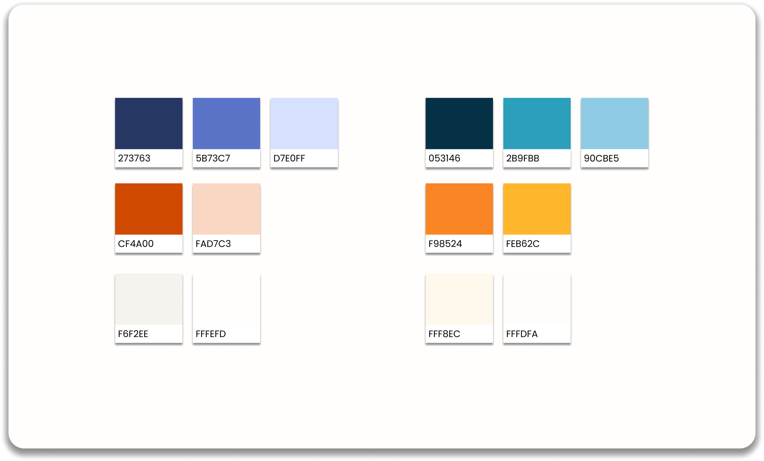
I finalized two options to send to the client:


Color Palette
I then worked on designing the company’s logo. I wanted an image of a home included, but was torn between a modern, sleek look vs a whimsical look. I presented the client with two options before including the color palette.
Logo


Final Logos

Style Tile

With all of the research, defining, and first steps of the design process behind me, I moved on to my favorite part of the design process: creating high-fidelity prototypes!
High Fidelity Prototype
Launch page
Home page
Listings page
Option for users to add a listing they have found

Filters for listings
Property page
Reservation pop up with details of reservation inclusions
Confirmation message explaining reservation

I added a pop up for new users when they first download the app with brief explanations
Test
After completing the prototype, I recruited participants for usability testing. Users were tasked with finding and reserving a specific property.
Results
All users were able to successfully navigate through the app to the requested Miami property and reserve a share of the property.
Task completion rate: 100%
Conclusions
Finding the property was intuitive
The onboarding screens were helpful in explaining what the app was for
Reservations were slightly confusing
While all users were able to complete the task, most had follow up questions about the reservation process itself. I reworked the reservation screen pop up to include more information.
Iterations

I added details about payment to this explanation
I moved the number with the + and - to its own line
This pops up when the user clicks on the question mark to provide further explanation
Learnings and Next Steps
This project taught me how to navigate working with a client’s vision while keeping the user’s best interests in mind
Having multiple options throughout the design process helped both me and the client effectively visualize the product and figure out what was and wasn’t working
Being open to feedback and willing to iterate was crucial for this project
My next step would be to design more screens to showcase more user flows. Looking towards the future, the final step upon the completion of the mobile app would be to adapt to a desktop website.

