Silver Linings Cooking

A responsive website for a suburban catering company.

Screenshot of a website homepage for Silver Linings Cooking, featuring a logo with a tea cup and planet, a navigation bar with links, a prominent header saying 'Silver Linings Cooking', with the tagline 'Catering that feels like home', and an image of a dessert table with cupcakes and flowers behind the text.

TIMELINE
80 Hours

ROLE UX Researcher UX/UI Designer

Overview

Silver Linings Cooking is an up and coming catering company based in Metro Detroit. It is a small business comprised of the two caterers who built the company. The company was established in 2020 and launched their website in 2021. 

The current website is confusing and difficult to navigate, therefore their only client base has been through friends and word of mouth.

Problem

Update the website by improving the visual appeal and functionality to create a seamless user experience and optimize SEO to grow their customer base.

Solution

The new design has made the ordering process easier for both the caterers and the customers. With the publication of the new design, online ordering has doubled!

Old Design

Screenshot of Silver Linings Cooking website homepage featuring a logo, contact information, a large photo of two women smiling outdoors, and smaller images of cooking and gardening activities.

New Design

Screenshot of Silver Linings Cooking website with a header image showing a dessert table with cupcakes, cake pops, and a flower arrangement. The page features sections on about us, customer testimonial, Instagram photos of cookies and baked goods, and a newsletter sign-up form.
A screenshot of a Wikipedia page discussing the COVID-19 pandemic in the United States.

My Design Process

Research

Usability Tests

Affinity Map

Competitive Analyses

User Persona

Feature Roadmap

Site Map

Define

Mid-Fidelity Wireframes

UI Kit

High-Fidelity Prototype

Design

Usability Tests

Iterations

Test

Black background with blue handwritten text that says "THE STORY" diagonally across the image.

The current website is not prioritizing the main lucrative aspect of the business: recipes, blog posts, etc. are all given the same prioritization as the actual catering

I want to make the catering (menus, online ordering) the star of the show to improve business traction and customer satisfaction

Once the customer base grows, the client can focus on the other aspects of the business that they enjoy creating to expand on their dreams for the company

Research

Based on my conversation with the clients as well as my own investigation of their website, I determined the goals of my research:

Research Goals

Conduct research on local competitors 

Determine pain points for customers navigating through the website

Learn questions that customers have when ordering catering

I conducted a usability test because I needed to observe user interactions with the current website and note pain points/room for improvement. I wanted to see what needed to be fixed and what was working instead of starting over.  

Assessing the Damage

100% had questions about the ordering process

100% had a hard time navigating through the website

Quantitative Results

  • Catering page is difficult to navigate: each menu category opens to an entirely new tab

  • Catering form is confusing: can’t specify what you want to order

  • Website is somewhat visually appealing but improvements can be made 

  • Navigating from page to page on the website is confusing: task bar is at the bottom of the page

  • Some pages on the website seem confusing/unnecessary: store page is empty, gardening page is not related to catering

Conclusions

I created an affinity map based on my usability test results. This helped me organize my user’s pain points/suggestions in order to prioritize changes.

Organizing and Analyzing

A black arrow pointing left with a curved tail.
A yellow sticky note with black text that reads: 'Likes that website is bright and has color' on a black surface.
Blue background with black text that reads: "There should be a place to put comments on the order form".
A hand-drawn black arrow curving upward and to the left.
A black arrow pointing downward with a curved tail.
A blue information box with black text that reads, 'About section could be easier to find'.

Assessing the Competition

I asked the clients who their main competitors were and conducted a competitive analyses.

Comparison chart of different catering services with logos and checkmarks indicating features included, such as visually appealing photos, testimonials, quality pictures, online order forms, and partial ordering.
A curved arrow pointing to the right, depicted in blue.
Text reading 'Main Competitors' in large purple letters on a white background.
Sketch with handwritten text that says "Features based on user interviews and secondary research."

Competitive Analyses

  • 2 out of the 3 websites were not high quality/visually appealing and were not as user-friendly as I would have suspected

  • The 1 website that was higher quality was said to be less of a competitor to their business because they are higher-scale

  • I learned that these are long-established companies in their area, thus the quality of their websites is not as important

I was left confused after my analysis:

Conclusions

The quality of Silver Linings’ website is important because they are working to become as established as these companies.

Define

I created a user persona to help represent the customer base of the website. This helped me remain focused on who I was designing for throughout the design process.

Who am I Designing For?

Handwritten text in dark blue that says 'Most Customers Are Women'.
Text in dark blue handwriting font that reads: "One of the main events they cater for".
A curved arrow pointing to the left, drawn in blue on a dark background.

User Persona

I created a feature roadmap to help me with prioritization in my design process. I went through their current website to see the existing features and prioritized based on what what would be the most important for the consumer.

Prioritizing the Design Process

Flowchart with sections labeled 'NOW,' 'NEXT,' and 'LATER,' each containing related options such as 'Menus,' 'Online Ordering,' 'Contact,' 'About us,' 'Gallery,' 'Blog,' 'Recipes,' and 'Gardening.'
A black arrow curving downward and to the right with a teal arrowhead.
Handwritten sign in blue ink on a black background that reads, "Everything directly related to catering."
A black arrow pointing to the right with a curved tail.
Handwritten text saying, "Good for future growth and branding."
Blackboard with a blue curved arrow pointing left.
Handwritten text in dark blue says, 'Helpful for getting to know the company.'

Feature Roadmap

I created a site map to help me organize the new layout of the site and visualize how a user will navigate through. I used my secondary research of catering websites to help me organize.

Re-Organizing the Navigation

Handwritten text on black background reading "Putting the focus on the catering pages so that new customers can easily find what they are looking for."

Old Website

old and new for comparison

Text on a black background stating 'Based on the usability testing, this original layout made navigation confusing for users.'

Design

I started the design process by researching popular catering businesses and noting what worked visually and functionally. I then began designing my wireframes.

Bringing the ideas to life

Redesigning Around Pre-Established Branding

After completing my initial wireframes, I worked to establish the design elements of the website. The clients wanted to keep their original logo, so I based the UI kit around that, with a fun yet professional feel in mind.

Design mockup of a website or app interface for "Silver Linings Cooking." It features a logo with an orange pot and steam, a color palette with swatches in dark blue, white, light blue, mustard yellow, and gray, and typography samples with various font styles and sizes. There are also section headings, buttons, and icons visible in the layout.

Prototype

With the UI kit and wireframes complete, I moved on to create a high fidelity prototype on Figma.

Website homepage for Silver Linings Cooking featuring a banner image of a dessert table with cupcakes and floral decorations.

Comparing the Designs

A screenshot of the Silver Linings Cooking website, featuring a woman with curly gray hair and black glasses posing smiling next to another woman with black hair. The website header includes a logo with a cooking pot and the text 'Silver Linings Cooking,' and the contact information for serving the Metro Detroit area. Below the header, there are images and links related to cooking classes, recipes, gardening, videos, and blog content, with a footer containing navigation links and social media icons.

OLD

Handwritten note stating 'Moved the taskbar to the top' in blue marker.

NEW

Silver Linings Cooking website homepage with a banner image of a dessert table decorated with flowers and treats, a photo of two women wearing aprons and oven mitts, and images of cookies, bread rolls, and muffins.
The image contains the handwritten words "ADDED TESTIMONIALS" in large blue letters.
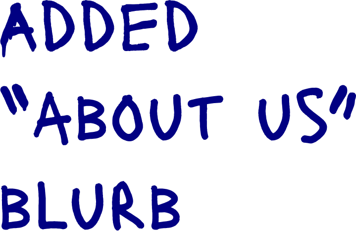
Text reading 'ADDED "ABOUT US" BLURB' in blue on a black background.
Text on a black background that says, 'ADDED EASY LINK TO INSTAGRAM' in blue, hand-drawn style lettering.

For the general menu, the client has an order form that they say has never been used. Customers need to reach out to place an order. I confirmed that they prefer to be contacted for general orders anyway, so I made the information easier to access.

The text in the image reads "The original home page was confusing and lacked information" in blue handwritten font.
Website homepage for Silver Linings Cooking, a catering service serving the Metro Detroit area. Features a header with the company logo, contact info, and a photo of two women in kitchen aprons. Below are images of various dishes including appetizers, soups, salads, sides, meats and poultry, entrées, and desserts, with links to order and to view a to-go form.
Text on a black background reading: 'Each menu page would open to a separate tab' in blue handwriting font.
Three images of appetizers: stuffed mushrooms with herbs, spring rolls garnished with parsley, and fried cheese balls.
Handwritten text on a black background that says, 'Contact options easily accessible on the page'.
Handwritten sign that says, "All menu options can be navigated to one page" in blue ink.

Client offers weekly preset Shabbat order options. They typically have three to choose from but allow the option for customization.

A web page for Silver Linings Cooking displaying a Shabbat order form with fields for name, email, phone, date, number of attendees, menu options, comments, and a submit button. The page features a header with navigation links, a large background image of bread with sesame seeds, and a footer with contact information and social media icons.
Online order form with fields for name, email, phone, date, soup or salad choice, answer, and radio buttons for order number, with a submit button at the bottom.
Text on a black background that says 'NO OPTION TO CUSTOMIZE' in blue, handwritten-style font.
Text that reads 'Very Little Information' in blue, handwritten font.
Text saying 'Added the option to customize' in blue handwritten font.
Handwritten text on a black background states, 'Different menu options are listed on the form.'

Test

I sent out my Figma prototype and conducted usability tests over Zoom.

5 participants from various backgrounds were observed and offered feedback. Participants were given two tasks to complete: contacting for a general menu order and customizing a Shabbat order.

Participants were then asked to provide general feedback on the feel/flow of the website.

Tasks

Task 1: submit a customized Shabbat Order

Results

Task completion rate: 100%

Task 2: browse the general menu and contact to place an order

Task completion rate: 100%

On the Shabbat order form, I received feedback that the plus sign under the soup option was confusing. I went back to my design to find a more intuitive solution.

Iterations
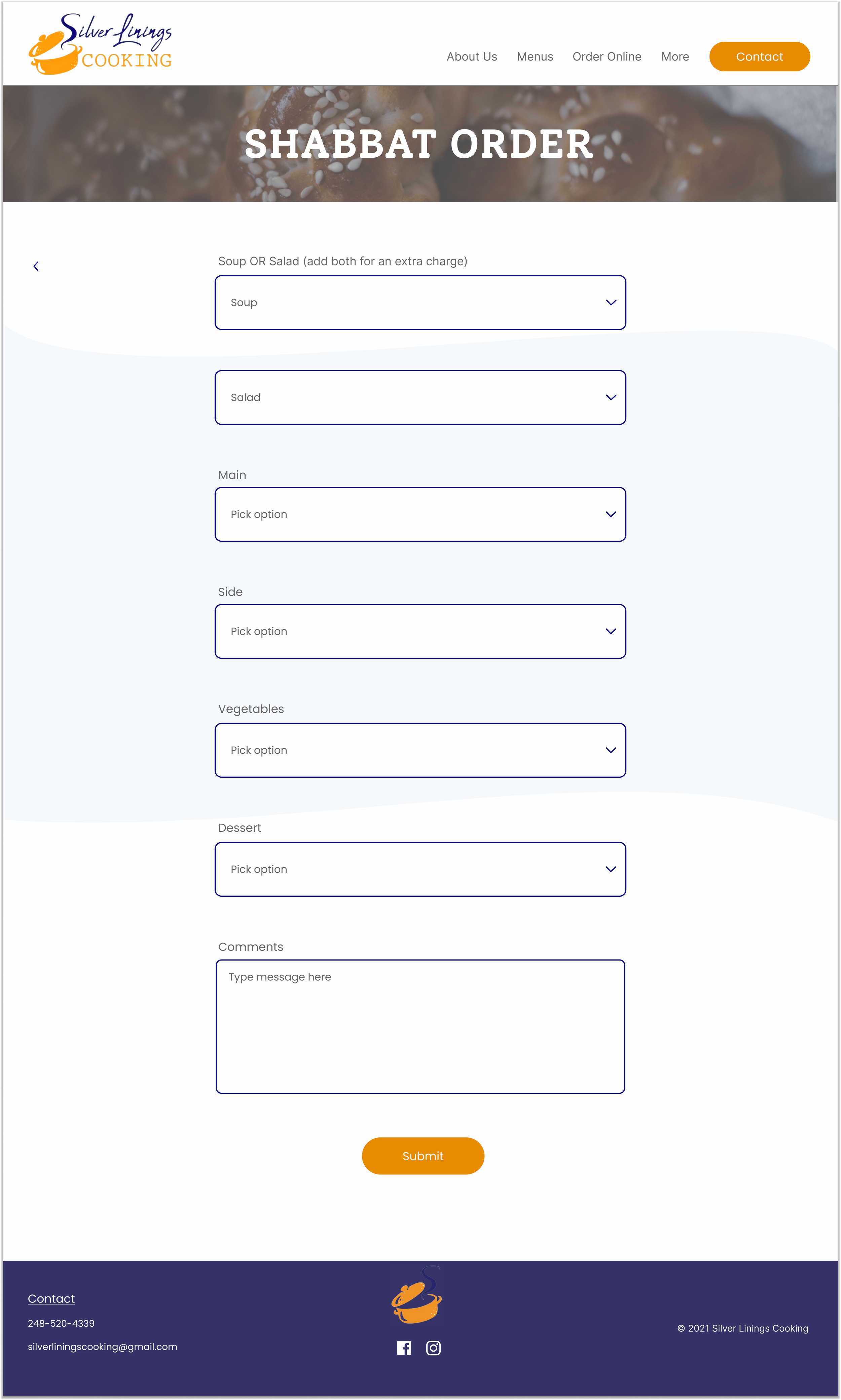
Screenshot of a website page titled 'Shabbat Order' from Silver Linings Cooking, featuring a form to choose meal options such as soup, salad, main, side, vegetables, and dessert, with a comments section and a submit button. The page has a header with navigation links, and the footer includes contact information and social media icons.
Handwritten note stating, "I DECIDED TO GET RID OF THE PLUS SIGN TO ADD ANOTHER OPTION AND INSTEAD INCLUDED BOTH OPTIONS WITH AN EXPLANATION OF THE CHARGES."

Learnings and Next Steps

  • Since I was working on updating an already existing website, I learned the importance of user feedback in figuring out what works and what doesn’t.

  • I learned the difficulties of navigating the needs of the user with constraints from the client. Having continual check-ins with the client throughout the design process was crucial for keeping me on track.

  • Without running ideas and designs by the client, I would have found myself losing time by going back to change already completed designs.

  • After completing this project, I continued to design for the remainder of the site. I published the completed website using Wix, and I continue to update their website as their business grows.